In the end, we decided on the purple sky to give a sense of mystery.
Showing posts with label Design. Show all posts
Friday, June 6, 2014
Color Comps
The next task for the poster is color comps. We wanted to make sure that the color palette we chose conveyed the right atmosphere, so these were the choices we were deciding from.
Monday, May 12, 2014
Let's Build an Environment: Modular Assets
Hello again,
Today I'll be talking about taking the messy geometry I first made to layout the level, and refining that into something much more efficient and reminiscent of an old forgotten World War 2 gun battery. My goal main goal now, is to take this level and turn it into separate pieces so the level can be modular.
I first go over the level I have now, and I eliminate some unnecessary rooms and hallways. While I'm doing this, I'm also identifying what each room is used for, and what the story might be behind it as I go. I'm trying to find a good point in between practicality and the organic feeling you get from the original layout.
Once the excessive bits have been parsed down, I start to break down the area into smaller bits. I want to be as conservative as I can be in this step, but not break from my parsed down layout. I decide on a grid scale for the simpler assets to abide by first, in this case a 1x1 square on my grid would be 4x4 meters, and all hallways height's would be 3 meters. I then made the simple hallway objects from scratch, having them match the dimensions of the layout as closely as I could. From there I took each of the unique pieces and adjusted them so they could connect with the modular hallways.
As soon as the layout was complete I exported each object and created the bunker layout in Unity. For there I did a camera pass, which made the level navigate able by the player. With the level laid out I could now go in and model out the geometry of each piece without having to layout the level any further. Below are pictures of the final modeled pieces and the final level layout.
Today I'll be talking about taking the messy geometry I first made to layout the level, and refining that into something much more efficient and reminiscent of an old forgotten World War 2 gun battery. My goal main goal now, is to take this level and turn it into separate pieces so the level can be modular.
I first go over the level I have now, and I eliminate some unnecessary rooms and hallways. While I'm doing this, I'm also identifying what each room is used for, and what the story might be behind it as I go. I'm trying to find a good point in between practicality and the organic feeling you get from the original layout.
![]() |
| Rough parsed level layout with room identifications. |
![]() |
| First pass modular geometry. |
![]() |
| Second pass modular geometry. |
![]() |
| Level layout with modular geometry. |
![]() |
Monday, April 21, 2014
Monday, March 24, 2014
Line Quality
Today's post will be on line quality. One of the key pieces to the art style for Shove Aside is the thick, graphic lines. As we are going for a gritty comic style, it helps breathe life into the world. In the poster, we wanted as much variety as we could get to differentiate the different materials in the world. The texture of dry patchy grass is different from a thick leather jacket or tree bark. Each part is simulated with different splotches and strokes to best evoke the feeling of that material as well as provide some artistic flair. In the examples above, you can see the different types of line quality used for the base of a tree, Dani's hair, patches of grass, tree bark, Dani's jacket, bushes, and Gabe's pants. Stay tuned for more updates!
Labels:
Concept,
Dani,
Danny,
Design,
Gabe,
Line,
Pictures,
Poster,
Progress,
Quality,
Shove Aside,
Style
Monday, February 24, 2014
Poster Creation
The next task for conception is the poster design. It will be a challenge to capture the essence of the game in one picture. The first part of the design process is figuring out what will be highlighted. As a narrative-driven game, we felt that the characters and and iconic location in the town should be prominently featured. The next step is looking for inspiring movie posters that provoke the same idea as the game. A few examples:
With the reference images and our own ideas of what the design should be, we created many thumbnails to see where the composition could go. Once a thumbnail was agreed upon to have the strongest impression, work on the final design has begun! We'll keep you posted as things come together.
Sunday, October 6, 2013
Biweekly Games Proudly Presents
Hello all,
We’re Biweekly Games, a burgeoning independent studio, and we’re happy to announce the first game in our series:
Shove Aside is an co-operative episodic adventure series following brother-sister duo Gabe and Dani Kassa as they adventure throughout the pacific northwest, facing off against all variety of supernatural creatures. Think a mixture of the show Supernatural and the game Eternal Darkness: Sanity’s Requiem. Shove aside offers great characters who will grow and change based on your choices; choices that have a lasting, meaningful effect on not only the characters but all of the world; co-operative gameplay including puzzles, conversations, and exploration; a pacific northwest setting, and elements of horror directly relating to the evils you’ll be facing. The evil's you'll be facing each episode are based on a different emotion, the first installment is Grief.
Characters
Players will take control of Gabe (Gabriel Kassa) and Dani (Danielle Kassa) a brother and sister from Arizona. After a litany of mistakes over the past few years, the two have been recently reunited. Together they’ve taken on a strange responsibility, putting their faith in each other to overcome the trials that lie ahead.
Dani is the muscle. She’s playful, headstrong, forward, and instinctive. Always the outgoing life of the party, shes acquaintance to many, friend to few. She keeps her guard up, never wanting anyone to close. She’s always looking to solve problems blunt and quick, often great short term, but with big consequences in the long run. Working as mechanic since she dropped out of college she’s been yearning to get out and see more. Shes excited to tackle the world with her dork of a brother, one of the few shes close to.
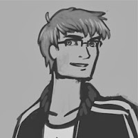
Gabe is the brains. He’s snarky, charismatic, thoughtful, and philanthropic. A studious orator Gabe has a way with people, but a problem with authority. Gabe will often get in trouble bending the law, and stepping on the fortunate. Often to prove a point, or help out the vulnerable. Gabe tends to think patiently things through, but can easily lose his focus in the face of injustice. On the run for white collar crime, Gabe found his way home looking for direction. He’s eager to put a smile on his sisters face, as they face the trials ahead.
Gameplay
At it’s core Shove Aside is a narrative adventure game, with the gameplay focusing on investigation. You’ll have to solve the mysteries behind the supernatural entities you’re trying to defeat. You’ll accomplish this through exploration, dialogue with townsfolk, and the the occasional puzzle.
We want your experiences with NPCs to be rich and open, encompassing more aspects of a conversation than just the dialogue itself. You will be able to approach the dialogue in different ways. If a hobo asks you for money you can be aggressive or caring. If a cop asks for your information you can be open or guarded. Whatever choice you make will set the groundwork for the conversation. You can also make actions during conversation. Pacing could make someone feel nervous, or sitting down next to someone could make them comfortable. Along with all this Gabe and Dani will have some different options in conversation, reflecting their unique personalities and experiences. All this will give the player a wide range of tools to run a conversation however they please.
Choices
While you are investigating the world still moves forward, changing and reacting depending on the choices you make. As you explore a church the tide may come in a cove you we’re interested in investigating. Breaking an entering may have the police waiting for you on your return. Threatening a pastor may result in a run in with his crazed followers down the road.
Your choices are determined by your actions, big and small, and not just a cut and dry dialogue choice. Choices also affect more than just the flow of the plot, they can affect the relationship between Gabe and Dani, bringing them closer or driving them apart.
We don’t want these choices to be an obvious fork in the game, you won’t be shown a dialogue box and have to choose between left or right. Rather you are shown left and right, each hallway silently implying what lies beyond. Some may be as subtle as this, while others are more obvious, the outcome relying on what action you take, if any at all.
Setting
The Pacific Northwest has a rich history, legends, and locations untapped by most television and video games today. Many of us have grown up here, while others have moved here, but at the end of the day we all have a strange love for the drab beauty of this place, and we want to display that love to everyone!
We will be using real world locations, but taking some creative agency where it better suits our needs. This first episode will take place at Cape Disappointment near Illwaco, WA. We urge you to take a trip yourself to check out some of the rich naval and native american history.
Horror
Gabe and Dani will be facing off against the unknown, the frightening, the supernatural. We want the powers of these creatures to be beyond the physical, you won’t be able to just shoot at them to win. Because of this we want our horror to be creeping, and tonal.
We feel horror isn’t about bombast, or making a player jump, it’s about setting a tone and building tension. We’ve taken a lot of inspiration from games like Eternal Darkness and slow building horror movies like Alien and The Thing. There will be no visual indicator that scary things are about to happen (like a horror meter, or screen effects), but places and situations. Dark corners, being alone.
We of course can’t tell you everything now, but we hope this is enough to catch your interest as we move forward. We’re updating every week and always happy to answer your questions. So keep an eye out however you like as more news comes your way.
Facebook: https://www.facebook.com/BiweeklyGames
Twitter: https://twitter.com/BiweeklyGames
Email: biweeklygames@gmail.com
Labels:
Characters,
Design,
Gameplay,
Grief,
Introduction,
Ryan,
Shove Aside,
Story
Sunday, September 15, 2013
Design Process for Dani
Hello there! I'm Danny Huynh, the concept artist for the team. I take broad ideas and create concept art for characters, environments, and anything else that helps to refine and nail down the look and feel of the game. Basically, I make pretty things. Ryan previously talked about the inspiration and direction we want the game to go, so today I'll talk about the design process for one of the characters, Dani.
When I first joined the project, I had a rough sketch and a character background. I read through to make sure I understood the character, and focusing on the main aspects of her personality, I needed to make a strong willed, outspoken, take charge kind of character. Before I started fleshing out her character, I wanted to have some of the more key physical features nailed down, namely her hair and clothing.
With feedback from the rest of the team, this is one of the first sketches I did of Dani. This was before I had the design elements applied. As you can see, her proportions and style are pretty average. We wanted something a little more stylized. Something with the grit of Backwater Gospel, the bold style of The Gorillaz, and the unique rendering of Ashley Wood. Taking in mind the inspirations for the game, my next sketch came out like this.
For being a leader-type character, I wanted to play with having a heavier lower body to give her a more grounded look. The other character in contrast is much slimmer. With this as the newer reference of how I would draw her, I played with some brushes in Photoshop to get a better vision of how she would look with texture.
When I first joined the project, I had a rough sketch and a character background. I read through to make sure I understood the character, and focusing on the main aspects of her personality, I needed to make a strong willed, outspoken, take charge kind of character. Before I started fleshing out her character, I wanted to have some of the more key physical features nailed down, namely her hair and clothing.
| Clothing and hair thumbnails. |
| One of my first sketches of Dani. |
| Notice the sharper angles, the play on proportions. |
![]() |
| Dani with texture and thick ink lines. |
![]() |
| Near final concept of Dani. |
This is the closest to final concept that I've gotten. Reassessing her design, I decided to go back a few steps to fix some problems. Her baggy pants wasn't reading quite the way I wanted, and with the jacket, having her come off as bottom heavy was a bit difficult. So, to remedy the situation:
| More thumbnails, more silhouettes, MORE EVERYTHING. |
I quickly pumped out some more silhouettes and thumbs to play more on her proportions. In the end, I've decided to flip her design, making her more top heavy (makes sense with the jacket right?) and to have thinner legs. Another feature that most characters will have is exaggerated hands. Most of the stylization will take place more in the body than the face. Even though the previous concepts won't be accurate to the final design, the work wasn't done in vain. It helped to visualize what the quality of the final piece will look like, and it'll be interesting seeing how different the final design will look compared to the original sketches!
Sunday, September 8, 2013
Creating the Style Pt.1
Hey all, and thanks for checking in on our weekly blogs. I’m Ryan Sand, a man with too many titles, but in this case we can call me our art director. I’m in charge of handling the development and cohesion of our art style as we move forward with the project, so that’s what I’ll be talking about today.
Since we've started working on Kassa, we've always wanted the game to have a dirty graphic style that would match the games setting and themes as well as stand out amongst most other games you’d find on the shelves today. Messy outlines with varied line weight, a dull color palette with spots of saturation, a good range of value, and a painterly messiness to our textures.
With that in mind we began to research a multitude of styles that fit our vision and how others have translated those styles into 3D. We latched onto many of the elements from artist Ashley Wood, and the animated short Backwater Gospel. We've been especially impressed with how well the messiness of Backwater was transferred into 3D, and can’t thank them enough for their making of video.
![]() |
| Danny started with broad simple concepts to nail down the look of the characters. Once he had their look down he started to brought the stylistic elements we researched to the the characters. |
As concept work develops we’re creating test assets to bring the style into 3D. Nearly all of our line work is going to be done in texture, similar to Backwater gospel. On this model we're taking advantage of extra strip geometry to give the asset outlines. Right now this is a box only with a diffuse texture, and from here we can quickly experiment to develop our unity shaders.
![]() |
| A simple crate for experimentation. |
The foundations been set and there is plenty more to come as our style develops further.
Subscribe to:
Posts (Atom)


