Pages

Sunday, June 8, 2014

Final Poster

We are proud to show the finalized poster for Shove Aside! Underneath, you can see the overall process of the poster.


Friday, June 6, 2014

Color Comps

The next task for the poster is color comps.  We wanted to make sure that the color palette we chose conveyed the right atmosphere, so these were the choices we were deciding from.


In the end, we decided on the purple sky to give a sense of mystery.

Monday, May 26, 2014

State of the Environment 6

Here is a quick update of the art and how it's coming along. My life has been unwrapping as of late, here are our unwrapped modular assets, and some interior objects for each puzzle area.


Monday, May 12, 2014

Let's Build an Environment: Modular Assets

Hello again,

Today I'll be talking about taking the messy geometry I first made to layout the level, and refining that into something much more efficient and reminiscent of an old forgotten World War 2 gun battery. My goal main goal now, is to take this level and turn it into separate pieces so the level can be modular.

I first go over the level I have now, and I eliminate some unnecessary rooms and hallways. While I'm doing this, I'm also identifying what each room is used for, and what the story might be behind it as I go. I'm trying to find a good point in between practicality and the organic feeling you get from the original layout.

Rough parsed level layout with room identifications.
Once the excessive bits have been parsed down, I start to break down the area into smaller bits. I want to be as conservative as I can be in this step, but not break from my parsed down layout. I decide on a grid scale for the simpler assets to abide by first, in this case a 1x1 square on my grid would be 4x4 meters, and all hallways height's would be 3 meters. I then made the simple hallway objects from scratch, having them match the dimensions of the layout as closely as I could. From there I took each of the unique pieces and adjusted them so they could connect with the modular hallways.

First pass modular geometry.
As soon as the layout was complete I exported each object and created the bunker layout in Unity. For there I did a camera pass, which made the level navigate able by the player. With the level laid out I could now go in and model out the geometry of each piece without having to layout the level any further. Below are pictures of the final modeled pieces and the final level layout.

Second pass modular geometry.
Level layout with modular geometry.


Monday, May 5, 2014

Let's Build an Environment: Layout

Hey all,

I wanted to do do a series of blog posts focusing on the construction of the interior of our level and my process in creating it. Since I work as Designer/Environment Artists I'll be focusing on both, but this first post will be design heavy, and the rest will probably be much more art heavy. That out of the way, let's dive in.

Here are the things I know when I start designing this level: This level will act as the demo for our game, it will be based on gun battery Mishler, located at Fort Steven's State Park in Oregon, and the player's goal is to open a set of blast doors on the ceiling to reveal the weakness of the monster they'll be fighting later in the game. Because it's our demo, I want to make sure that we showcase all of our mechanics, with an emphasis on co-operation. With that in mind I start by creating two puzzle rooms that require both of our characters to work together.

Original Puzzle rooms
Now I have two areas (made up of a couple of rooms), that I need to link together with the rest of the battery. I move into 3D since that's where I'm most comfortable and quick. Here I can go crazy, slowly discovering what the space will be as I go. I know I want a main hub, which will double as the location the player's reveal the monster's weakness, so I create that first. When creating the hallways I know I want the area to feel a bit like a labyrinth, with a lot of strange turns and corners, to make the player feel even lost when spooky things happen. I also make sure that I have multiple elevations and a dug out cave for flavor.


First pass battery interior geometry.
I'm now left with a big messy piece of geometry that I need to turn into a old gun battery.

Monday, April 28, 2014

Multiplayer!

Branden got it set up so that we could walk around the level with multiple people! So we did the only logical thing: run around the level taking pictures of the two protagonists with a third hiding creepily in the background. 


Dani and Gabe with Dani lurking in the background, shot 1
   
Dani and Gabe with Dani lurking in the background, shot 2

Dani and Gabe with Dani lurking in the background, shot 3

Monday, April 21, 2014

Value Thumbs


Line work on the poster is done! The next step is defining the values before the coloring phase.

Monday, March 31, 2014

Of Progress, Rewards, and Spooky Things

Today I'm going to talk a little bit more about teams. For all that content is super important (I mean, it's literally what makes up the game), in my experience with development most of the conversation focuses on content creation, so throughout development of Project Kassa, I'll be making periodic blog posts about other aspects that are important as well but seem to get a bit less emphasis. You'll be able to find all these posts under the "Producer" tag if you'd like to read more of them.

Last time I wrote one of these, it was about the assembly of a team, today we're going to talk a little bit about a lot of things, ultimately boiling down to morale. Keeping team morale high is important for team health, sanity, and quality of work. A team with low morale won't work as hard, or as well, as a team that is happy with themselves, each other, and the project.

One of the most important things to keeping morale high is a sense of accomplishment. People who have achieved something, or feel like they have, generally feel better about themselves and whatever it is they're working on. One of the easiest ways to do this is to track progress. Now there are a ton of ways to do this, and what is going to work for one team won't necessarily work for another, and sometimes what works for one team might only work for a specific project, so I'm going to stick with talking about what we're doing for this project rather than going too into the many options available.

We initially tried using VersionOne, which is a lovely site that I highly recommend trying if you are a fan of scrum and are looking for a reasonably priced option for it, the staff was communicative and the I found the interface very easy to learn and use. Unfortunately, it went under utilized, it didn't mesh well with the team. What we wound up with, and has been working so far for us, is a simple whiteboard.

Current Whiteboard


Different team members have different colored post-its, and we have three columns "To-Do," "In Progress," and "Completed." Only tasks from the current milestone (which - for us - is monthly), or outstanding from past milestones, are on the whiteboard. Each team member is responsible for moving their tasks to the appropriate column as they progress, and at the end of the milestone we take all the "Completed" post-its and stick them here:
Our progress spindle!
We bought a receipt spindle from an office supply store. There's something satisfying about impaling completed tasks on a pointy object. You may notice that our particular progress spindle has several marks on it, when we got it we decided to break it up into inches and whenever we complete enough tasks to reach an inch, we go on a morale adventure.

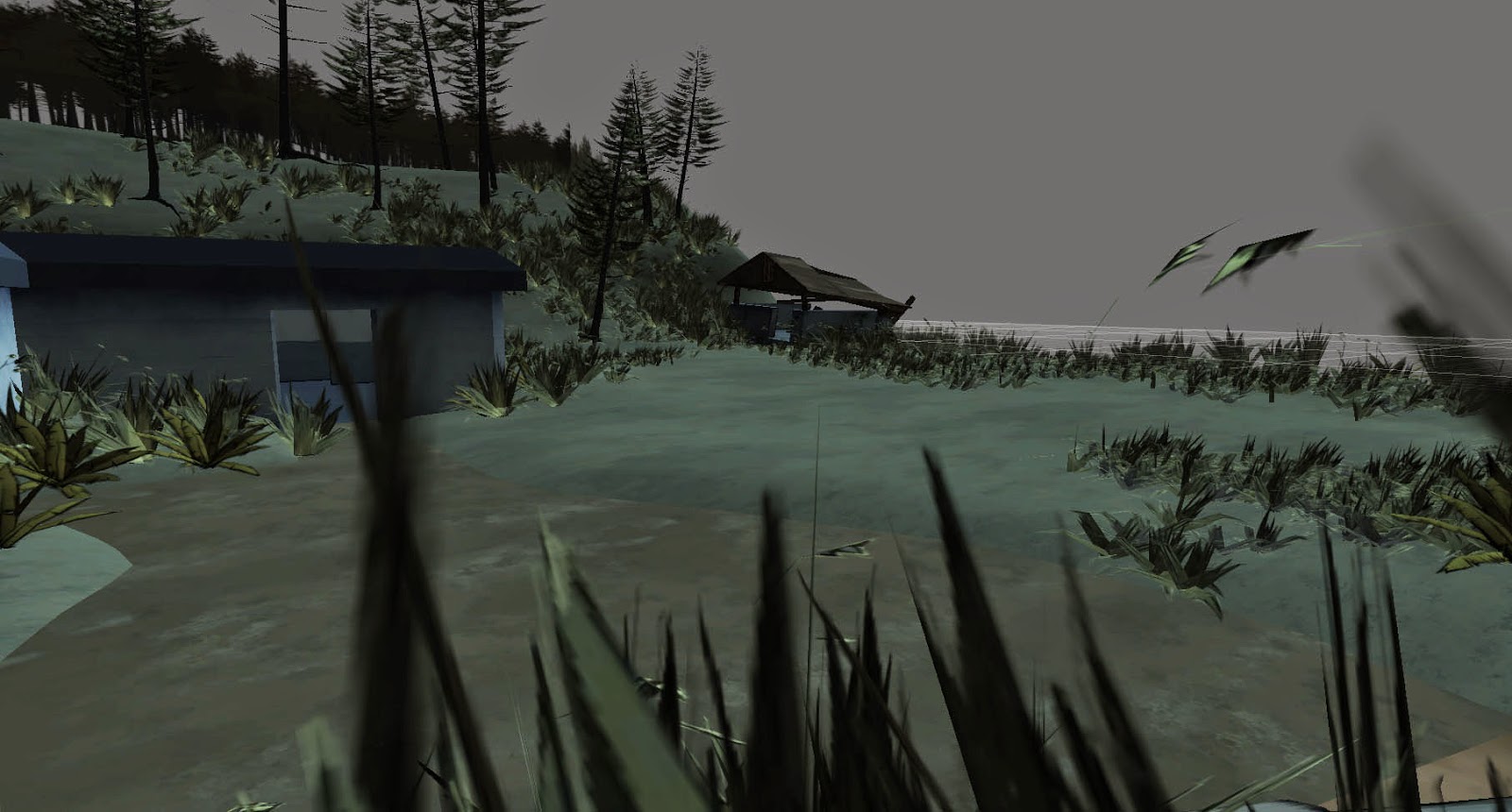
Morale adventures are fun, we've already done one in the form of visiting Fort Stevens in Oregon and Cape Disappointment in Washington, which gave us the additional benefit of a TON of photo/video/sound reference for our game as well as an opportunity to get out as a team and do something.

For our first inch, which we are rapidly approaching, we're discussing going to the ghost town Monte Cristo in Washington, where Danny and Branden will get us killed by following horror movie tropes instead of being sensible about the whole thing. The other options include the haunted soda machine in Seattle, or doing the Pike Street ghost tours. Obviously we lean towards spooky rewards, given the focus of our game and our apparent disinterest in not getting murdered by ghosts.

And once again, this post is turning out long, so I'm going to end it here, and talk a little bit more about smaller-scale morale boosting events in a later post.

Monday, March 24, 2014

Line Quality


Today's post will be on line quality. One of the key pieces to the art style for Shove Aside is the thick, graphic lines. As we are going for a gritty comic style, it helps breathe life into the world. In the poster, we wanted as much variety as we could get to differentiate the different materials in the world. The texture of dry patchy grass is different from a thick leather jacket or tree bark. Each part is simulated with different splotches and strokes to best evoke the feeling of that material as well as provide some artistic flair. In the examples above, you can see the different types of line quality used for the base of a tree, Dani's hair, patches of grass, tree bark, Dani's jacket, bushes, and Gabe's pants. Stay tuned for more updates!

Monday, March 17, 2014

State of the Environment 5

Here are some quick screenshots from Unity to show you our environment so far Our second color pass is looking successful as we altered all of our original textures and used a cooler and bluer pallet to create our new textures. We still have interior assets and lighting, soon to come.


Monday, March 10, 2014

Color for the color god.

We've been spending a lot of time thinking about color and shadow recently. Getting the right color to make the environments feel like the northwest is key, so we're using a lot of cold greens and blues. Here are some color comps of our environment.


Monday, February 24, 2014

Poster Creation

The next task for conception is the poster design. It will be a challenge to capture the essence of the game in one picture. The first part of the design process is figuring out what will be highlighted. As a narrative-driven game, we felt that the characters and and iconic location in the town should be prominently featured. The next step is looking for inspiring movie posters that provoke the same idea as the game. A few examples:


With the reference images and our own ideas of what the design should be, we created many thumbnails to see where the composition could go. Once a thumbnail was agreed upon to have the strongest impression, work on the final design has begun! We'll keep you posted as things come together.

Wednesday, January 29, 2014

A Fond Farewell...

Sadly, due to a conflict of interests, Frank has had to leave the project. We appreciate all the work and hours he put in making our rigs and troubleshooting all the issues, and wish him luck on his current team and project!

Monday, January 20, 2014

State of the Environment 3

Made some changes to the plant textures, added a temporary skybox, and added color to the remaining untextured elements. Not to mention adding Dani to the scene! Still working out alpha blending issues within unity, but the scene is in and playable. 

Unity Screenshot - First camera placement

Unity Screenshot - Panned first camera placement

Unity Screenshot - Panned first camera placement

Monday, January 13, 2014

State of the Environment 2

Added some plants to the scene, assets to be treated for proper alpha blending and appearance.